Work/Eventbrite
03 · Eventbrite · Commerce · 2014–2015
Buyers moved to phones faster than checkout did
Mobile visitors bounced far more often than desktop visitors. With most listings free, every extra checkout step cost attendance as well as revenue.
- Role
- Senior Director, Design and User Experience, 2014–2015
- Owned
- Attendee and organizer experience design and research
- Team
- 17 in design, research, visual design, and brand
- Partners
- VP of Product (reporting line), engineering, marketing, go-to-market
The mandate
Phone and tablet visitors bounced far more often
Engineering had set a responsive rebuild. I led attendee and organizer design and research through it, starting from these numbers.
Baseline: site analytics through early 2014, the problem the team inherited.
The diagnosis
With most listings free, friction cost attendance
The insight
Phone and tablet traffic was growing, and those visitors bounced far more often than desktop visitors. With most listings free, every extra checkout step cost attendance as well as revenue.
The decision
We stopped extending the desktop flow and rebuilt the attendee and organizer experiences responsively, starting with mobile checkout.
Tradeoff
My leadership decision was to make the rebuild the design organization’s priority, even though my own team strongly resisted because we were not fully ready for all the mobile decisions it required. We had a heated debate, but I paused almost all other design work, embedded designers into their corresponding engineering squads, kept one team advancing our emerging design system, and protected only a couple of critical customer initiatives already in flight.
Getting the team behind it
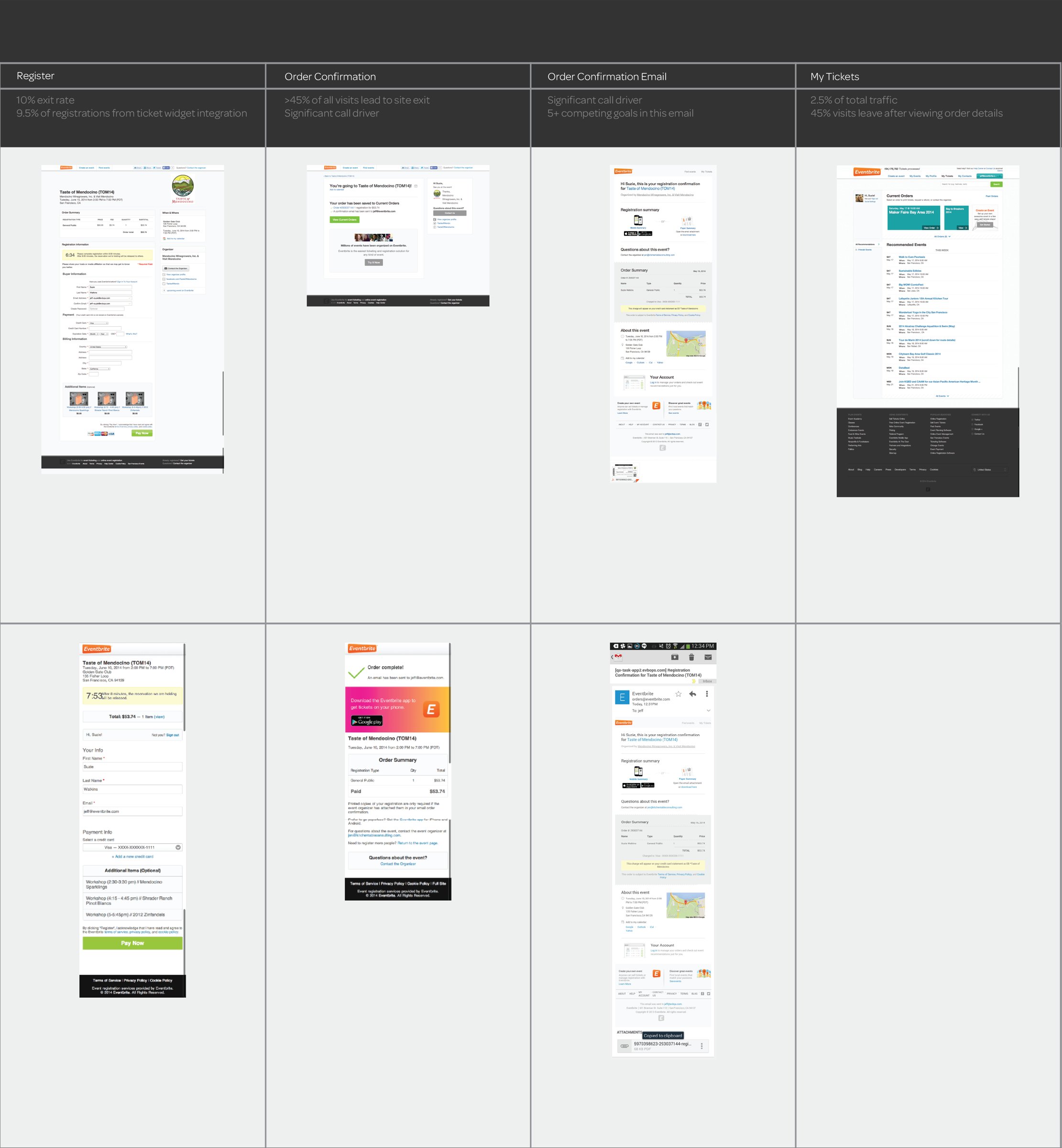
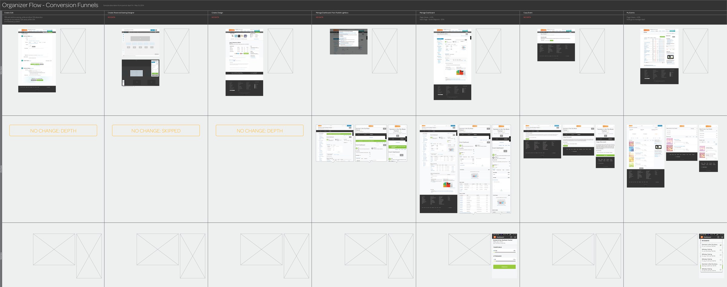
I chose checkout as the first journey, because every event, free or paid, runs through it. We mapped every desktop and mobile checkout screen for free and paid events, put the flows on the walls, and walked them together. The complexity became obvious, and the team came back with a much simpler approach.
Explore the first-ticket journey research
Research
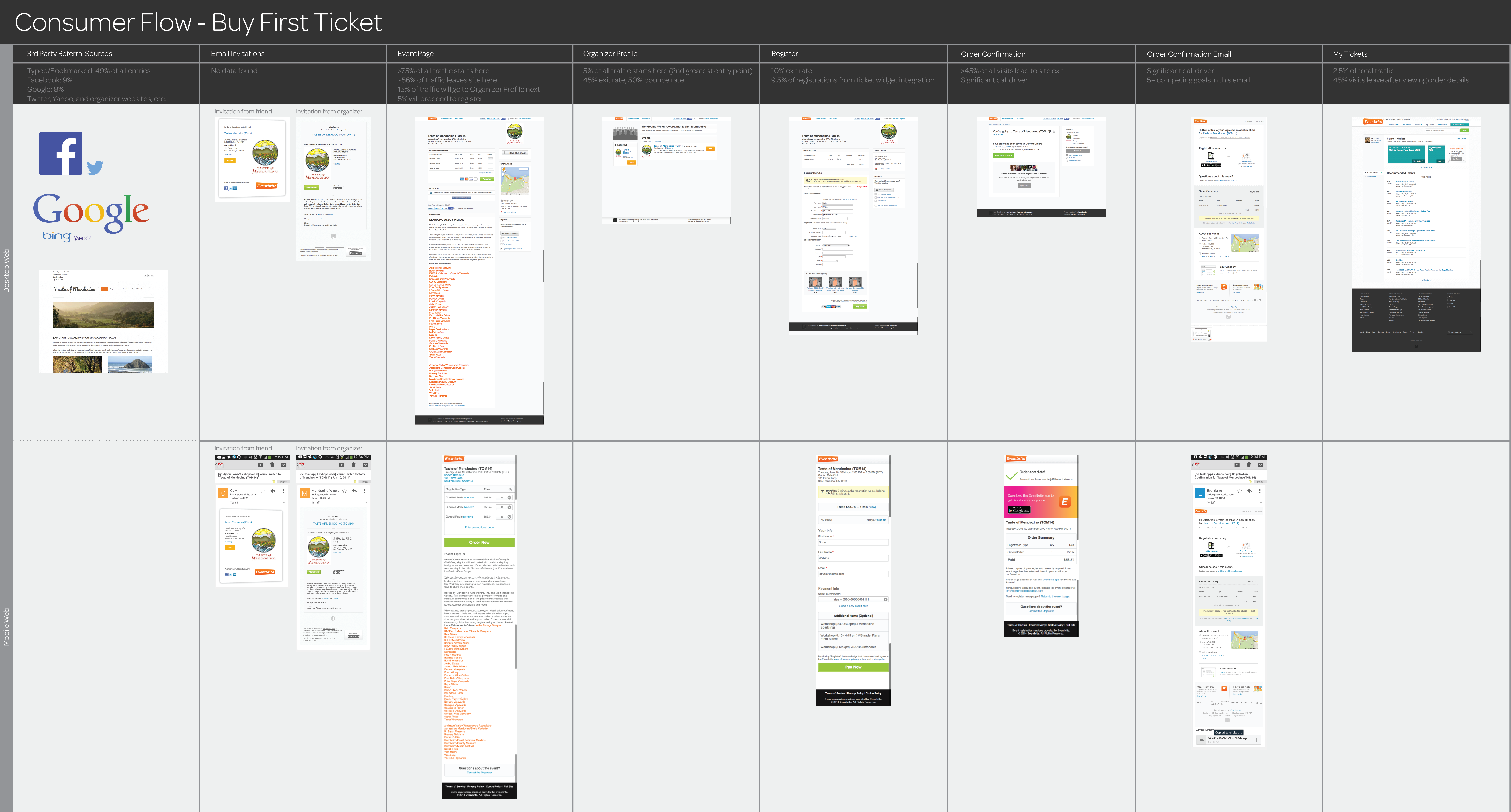
The journey behind shorter free-ticket checkout
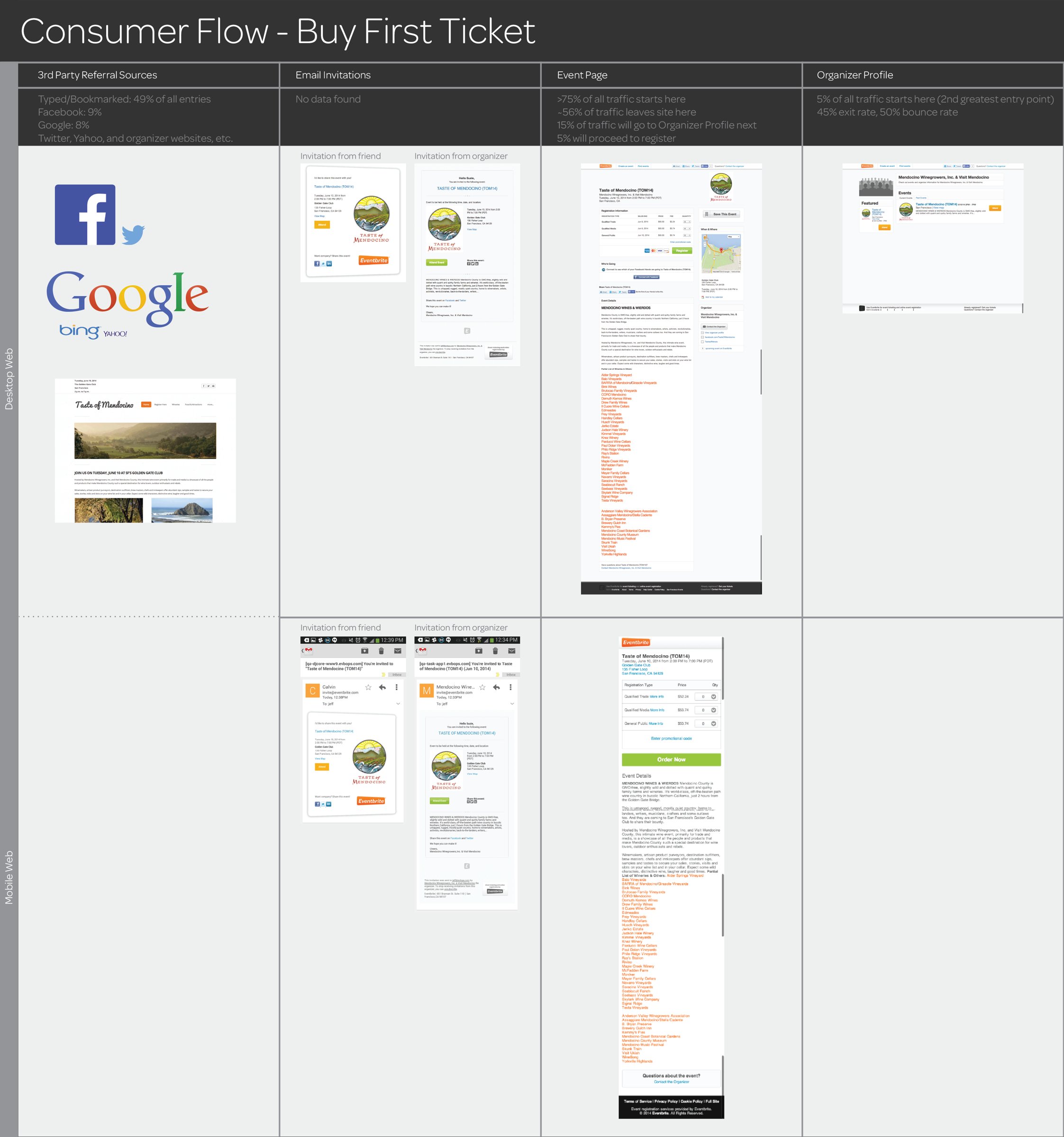
We mapped the first-ticket journey across desktop and mobile, from referrals and invitations through registration, confirmation, and ticket access. This analysis informed the shorter free-ticket purchase flow on mobile.
Leadership and delivery
A 16-week overhaul: shorter checkout, busier homepage
What shipped
Responsive mobile checkout with 40% fewer required steps, on a new design system.
The design system
One system for attendee and organizer products
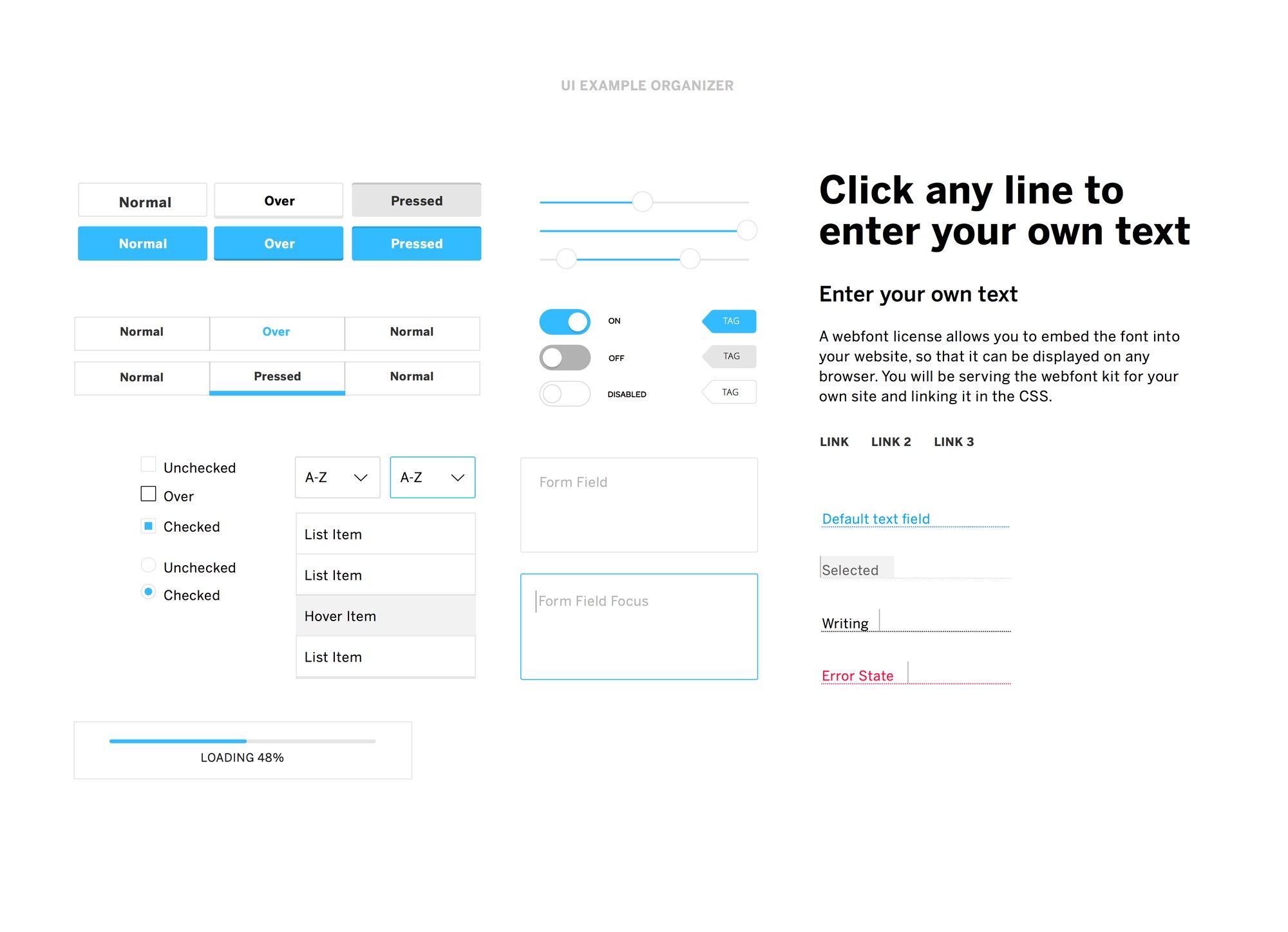
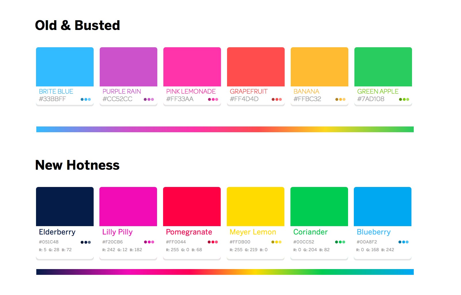
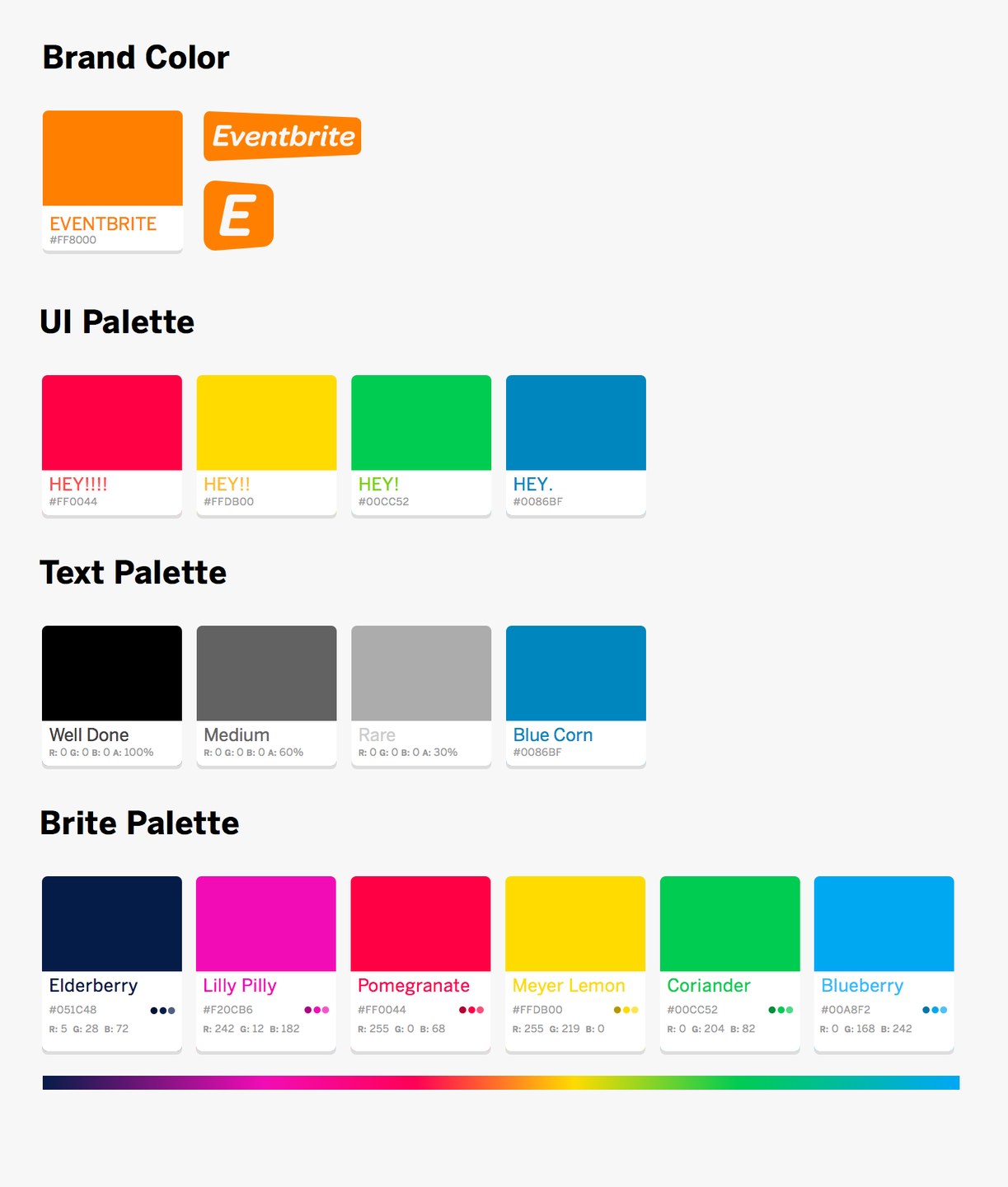
The rebuild ran on a new design system. We defined components once (buttons, form fields, selection states, and loading) and applied a refreshed palette across attendee and organizer products, so both looked like one product on any screen. Stakeholder research had asked for brand consistency, a shared asset library, and clearer usage guidance.
After checkout, we extended the system into search, event, and venue pages and, working with the VP of Marketing, brought the new brand into the product.
Outcomes and learning
Checkout lost 40% of its required steps
Two parts of the overhaul, measured separately. Checkout is measured by its required steps. The redesigned homepage is measured by the orders that started there.
See the research and design gallery
Gallery · Research to release
From journey research to a new visual identity
Research, checkout comps, and visual design from the rebuild. Select any image to open it full size.
Map the journey before cutting steps
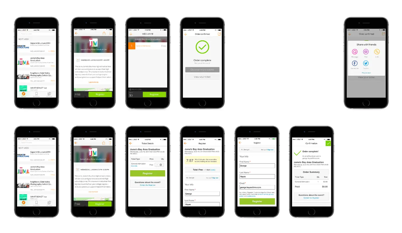
Cut free-ticket checkout to what buyers needed
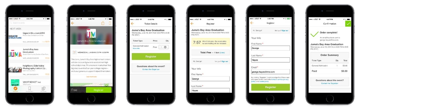
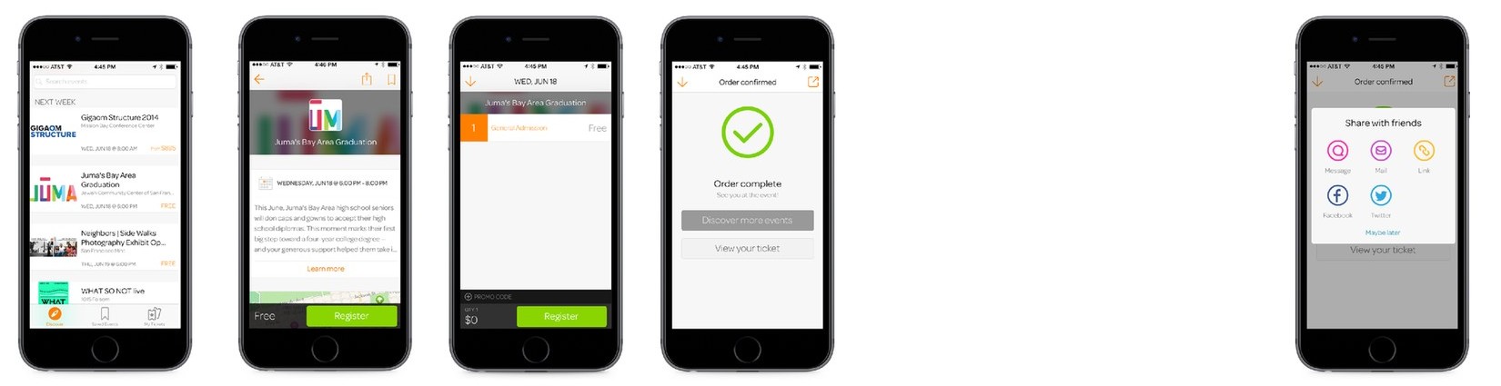
Checkout comp, 2014. The responsive checkout shipped with 40% fewer required steps.
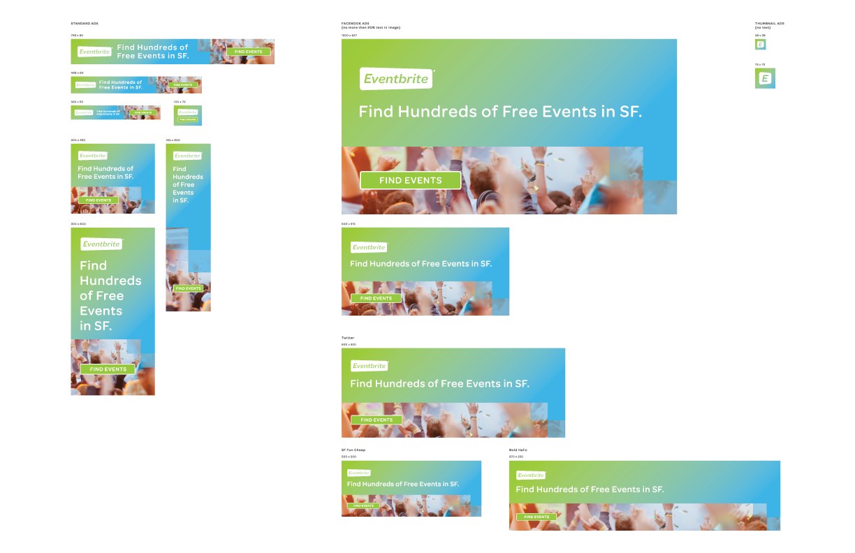
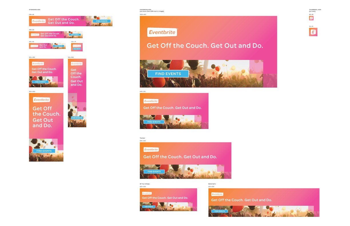
Updating Eventbrite’s identity alongside the product rebuild
The same palette and components carried across product screens, attendee and organizer apps, and campaign materials. These examples show the range of work my organization covered during the rebuild.

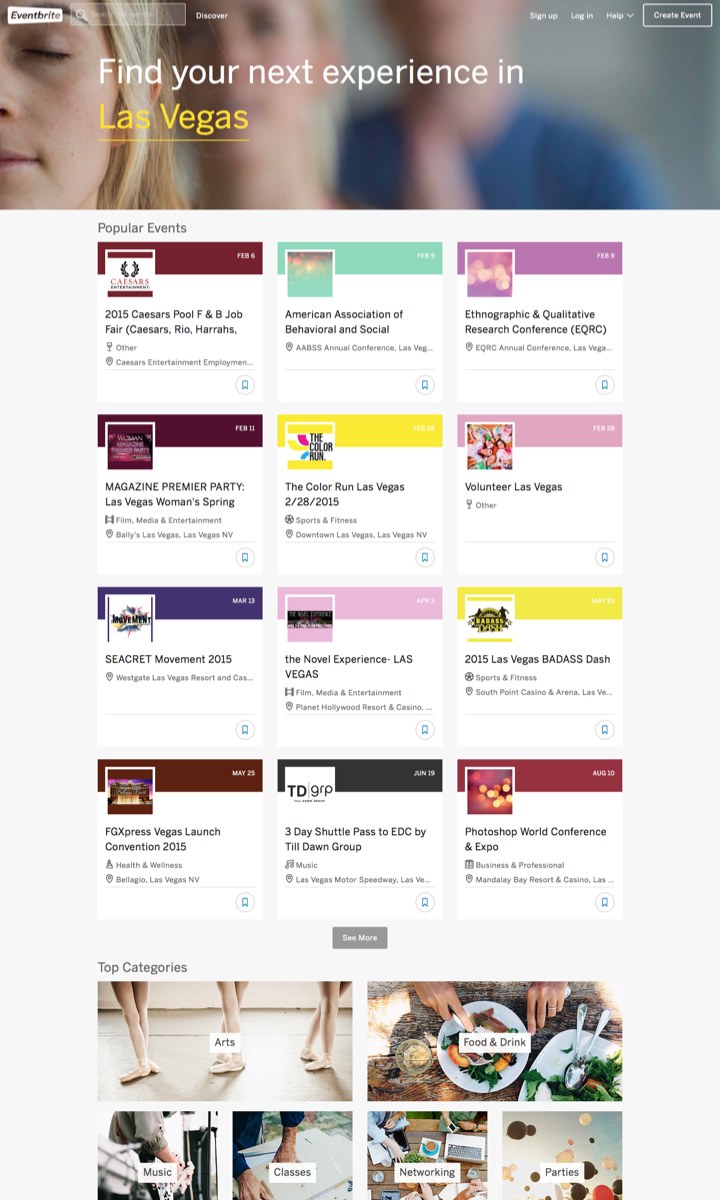
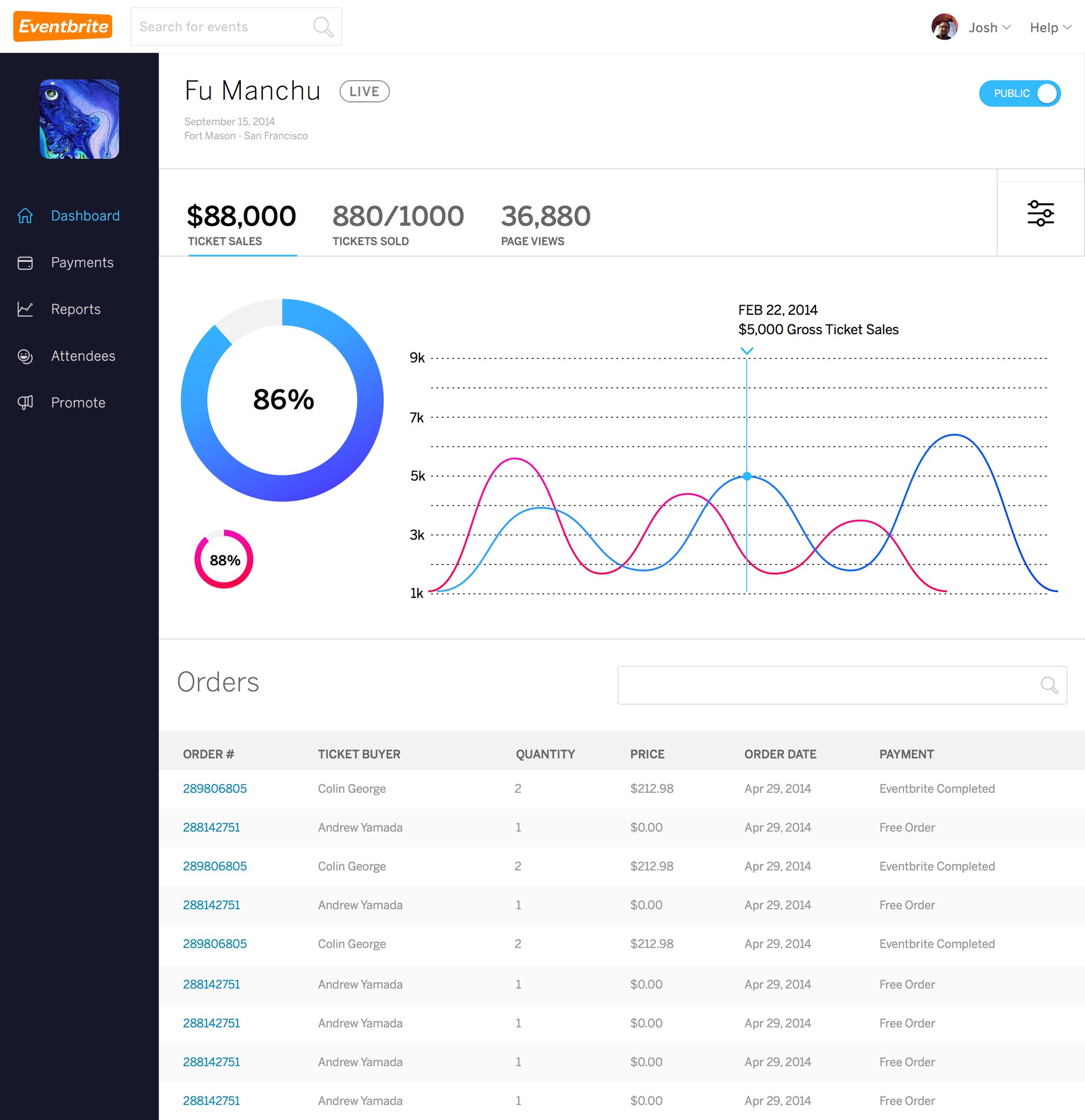
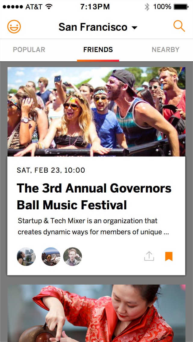
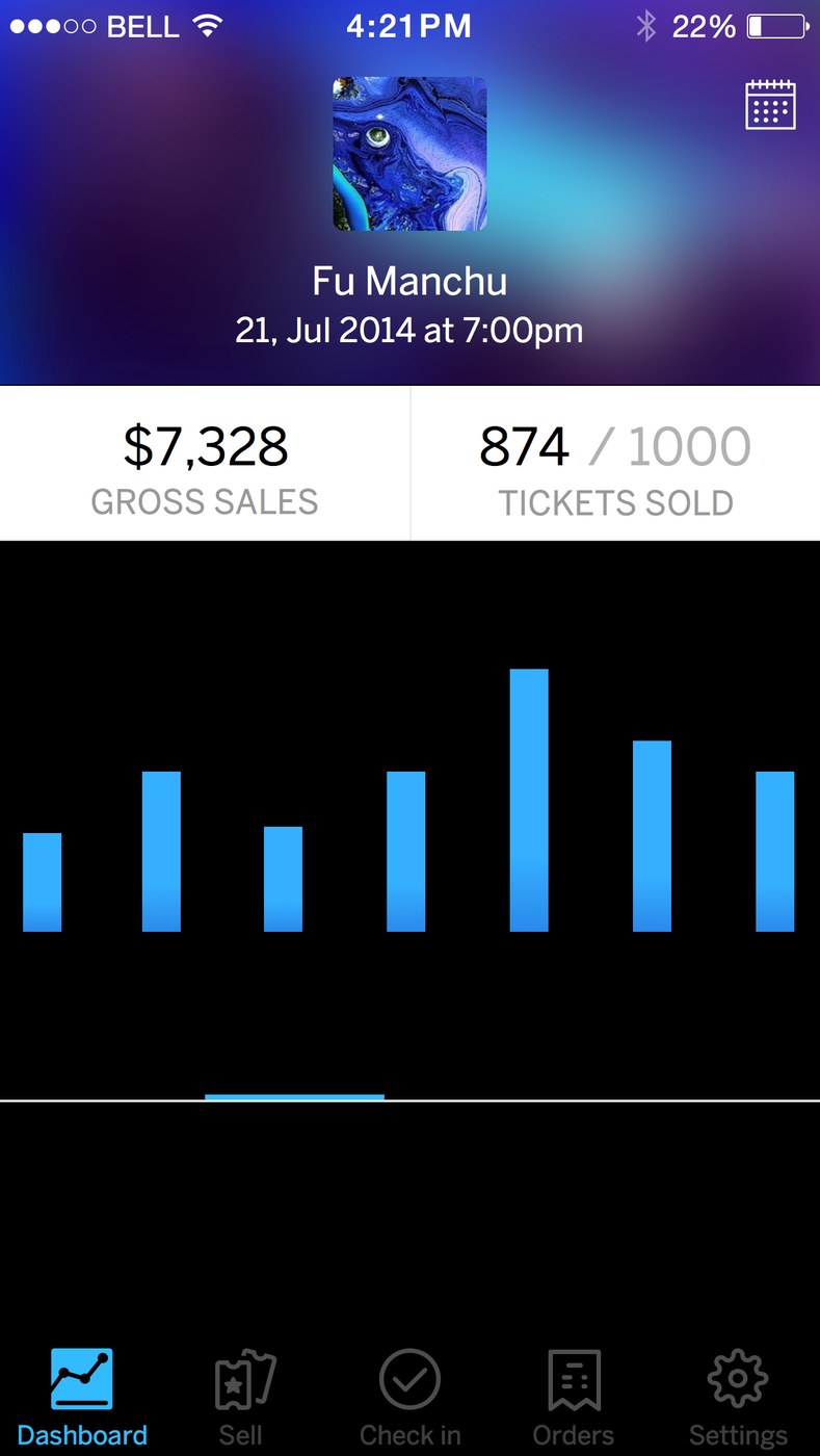
Design comps by the Eventbrite design team, 2014–2015. All figures and names are sample data.
The team
The Eventbrite design organization
The designers, researchers, and brand team behind the attendee and organizer experiences. Designers worked embedded in engineering squads during the rebuild, research mapped the first-ticket journey, and the brand team built the new identity.
 Tom
Tom Erik
Erik Lauren
 Evan
Evan Josh
Josh Dan
Dan Kirstyn
 Lumen
Lumen Jessica
 Anthony
 Chris
Chris Kyle
Kyle Jason
Jason Jeff
Jeff George
 Kristine